What Is the Bitcoin Rainbow Chart and How to Use It?

Many traders and investors wonder how best to interpret Bitcoin’s long-term trends. One popular tool for this is the rainbow chart. In this article, we will look at the rainbow chart’s history, how it works, and, most importantly, how you can use it.

WhiteBIT Cryptocurrency Exchange
What is the Bitcoin Rainbow Chart?
The Bitcoin rainbow chart is a visual tool that uses colors to represent long-term Bitcoin price trends. This chart is based on a logarithmic curve and divides the historical value of the cryptocurrency into several color zones, each symbolizing possible stages of the market cycle. For example, blue and purple zones indicate a possible market bottom and favorable buying times. In contrast, red and orange zones can signal an overbought asset and a possible price peak.
While the rainbow chart is not a scientific or strictly mathematical tool, its simplicity and clarity have made it popular among cryptocurrencies enthusiasts and investors who want to understand Bitcoin’s long-term trends better. The chart does not claim to make accurate predictions. Still, its goal is to help users assess the asset’s current market position based on historical data and assumptions about future price movements.

History of the Bitcoin Rainbow Chart
The “Bitcoin rainbow chart” was first introduced in 2014 by a crypto-enthusiast named Trololo. The chart originated as a joke on the bitcointalk.org forum, where users discussed ways to predict the price of Bitcoin based on historical data. Originally, the rainbow chart had no scientific basis, and its creation was more of an attempt to show long-term price trends simply and visually appealingly. However, given the high volatility of the cryptocurrency market, the chart caught the attention of investors as a convenient tool for evaluating possible price fluctuations.
Despite its ironic origin, the BTC rainbow chart quickly gained popularity among traders and investors due to its clarity and intuitive approach to interpreting market cycles. It was gradually adapted and improved, including accurate historical Bitcoin data and a logarithmic scale to depict price movements long-term accurately. Eventually, the rainbow chart became one of the informal market analysis tools used by those who want to get an overview of Bitcoin’s current market phase.

How Does the BTC Rainbow Chart Work?
The Bitcoin (BTC) rainbow chart works based on logarithmic regression, depicting the cryptocurrency’s long-term price trends. It divides the Bitcoin price chart into several colored zones, each representing a specific stage of the market cycle, from oversold to overbought. These zones help traders and investors assess the current market situation and potential scenarios visually.
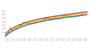
Each color on the chart corresponds to a specific zone:
- Purple and blue zones are oversold or “cold” phases, where the price of an asset is relatively low and may signal a favorable buying point.
- Green and yellow zones are neutral phases in which the market is stable and the price is moving in a mid-range. This may indicate an increase in interest without overheating.
- Red and orange zones are overbought or hot phases where the price is peaking, and the market may be on the verge of a correction.
The bitcoin rainbow price chart is not meant to be an exact prediction or guarantee, but its purpose is to give an idea of what stage of the cycle Bitcoin may be in, which helps users make decisions based on historical patterns of price movements.

How to Use the Bitcoin Rainbow Chart?
The use of the Bitcoin rainbow chart is based on its ability to visualize long-term market cycles, which helps traders and investors decide about buying or selling the cryptocurrency. Here’s how it can be used effectively:
- Market Stage Assessment: The rainbow bitcoin chart is divided into color zones, each reflecting different market phases, from oversold to overbought. For example, if the price of Bitcoin is in the purple or blue zone, it could indicate a potential market bottom and point to favorable buying conditions. On the contrary, if the price reaches the red or orange zone, it signals a possible overbought condition, which could be a sign to take profits or prepare for a fall.
- Support for long-term strategies: The bitcoin rainbow graph helps long-term investors avoid making emotional decisions based on short-term market fluctuations. It can be used to get a general idea of where a coin current price is in the context of a multi-year trend, which can help in a “HODL” strategy or when planning to exit the market at favorable times.

Bitcoin Halving and the Bitcoin Rainbow Chart
Bitcoin halving reduces the number of new bitcoins coming into circulation, which historically causes the price to rise due to limited supply. The BTC rainbow charts visualize long-term price trends by dividing them into colored zones, from oversold to overbought. After halvings, Bitcoin prices are often seen transitioning from low areas of the chart (purple, blue) to higher areas (green, red), indicating the start of a new bull cycle. These tools help investors assess the impact of halving and predict market trends.
Is the BTC Rainbow Chart accurate?
The cryptocurrency rainbow chart is not an accurate predictive tool because its basis is a visualization of historical price data using logarithmic regression. The chart divides prices into colored zones that help investors evaluate possible market phases but does not guarantee accurate predictions of future price movements. The Crypto rainbow chart is a reference point for long-term market understanding and a supplement to other analytical methods. Still, it cannot be considered an accurate or scientific tool for investment decisions. For example, the dollar cost averaging (DCA) strategy may be more reliable, allowing investors to enter the market gradually, minimizing the risks associated with its volatility.

Limitations of the Bitcoin Rainbow Chart
The Bitcoin rainbow chart has several key limitations:
- No scientific basis: It is based on a logarithmic regression visualization and does not use fundamental or technical analysis to predict prices, making it more of an intuitive rather than a scientifically sound tool.
- No accurate predictions: The rainbow chart BTC does not provide accurate price predictions but only helps visualize historical data, which limits its effectiveness in short—and medium-term forecasts.
- Does not take into account fundamentals: The chart does not reflect events that can significantly affect the price of Bitcoin, such as regulatory changes, macroeconomic conditions, or innovations in blockchain technology.
- Limited to use in isolated analyses: Using only the rainbow chart without additional analysis methods may lead to erroneous conclusions, as it does not consider current market conditions or supply and demand dynamics.
Trade cryptocurrency on WhiteBIT!
Bottom Line
The rainbow chart helps better understand Bitcoin’s market cycles and behavior in the context of past data. However, it is important to remember that the chart is based on historical information, and the future of the crypto market can change due to many factors. In addition, the use of a rainbow chart should not provoke FOMO (fear of missing out on profits), as any investment decisions should be made based on careful analysis, not emotion.