Price Charts in Technical Analysis of Cryptocurrencies
Interpreting price charts is not just a skill; it’s a necessity. In an era where cryptocurrencies are gradually becoming a new frontier in the financial world, the art of technical analysis (TA) plays a crucial role in shaping trading strategies.
TA, in simple terms, is the meticulous study of past price data with the aim of predicting future price movements. It’s a strategic tool that helps navigate through complex and often unpredictable waves of market trends and prolonged movements. Through TA, one can identify the sentiments driving the market — bullish “optimism” or bearish “caution.”

In this article, we’ll explore the fundamental elements that will help provide a basic understanding of technical chart analysis. Whether you’re a novice trader or an experienced investor, grasping these components is key to successfully interpreting price movements.
Analyzing Price Charts: Basics
Chart technical analysis is a crucial component of Technical Analysis (TA). It provides a visual representation of market activity. To become a professional trader, it’s essential to learn how to read these charts, as they are the primary indicators of historical and current market conditions. There are various types of crypto price movement representations.
Line Chart
Linear charts, or line charts, offer a simplified view of price movements. They represent closing prices over a specific period, providing a clear picture of market trends. While useful for identifying medium to long-term trends, they may not be ideal for short-term analysis due to their lack of detail. These charts are constructed as curved lines connecting the ending points of periods (minutes, hours, days, etc.).
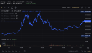
Example: Linear Chart BTC/USDT on WhiteBIT
Candlestick Chart
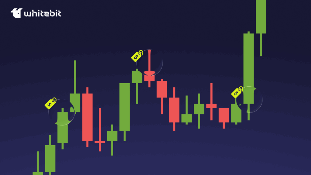
Candlestick charts are the most common and informative type. They predate other chart types like bars or, for instance, point and figure charts, offering a better understanding of market dynamics and more accurate price predictions. Moreover, they are memorable due to interesting names such as “dark cloud cover,” “evening star,” or “hammer,” among others.
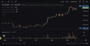
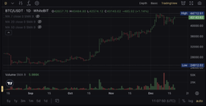
Example: Candlestick Chart BTC/USDT on WhiteBIT
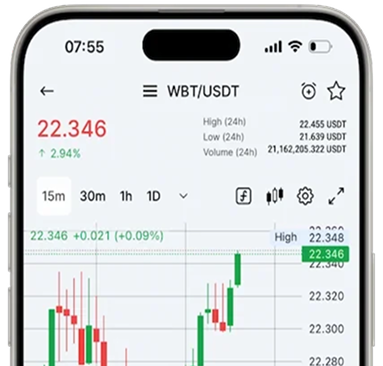
Each “candle” on the chart is a visual summary of price movement within a specific time interval. A candlestick chart displays price highs and lows, as well as opening and closing prices. The thick part of the candle, known as the “body,” represents the opening and closing prices, while the lines, or “wicks,” above and below, indicate the maximum and minimum prices. The color of the candle’s body indicates whether the closing price was higher or lower than the opening price: green typically signifies a price increase, while red suggests a decrease. Let’s delve into the candle’s structure in more detail:
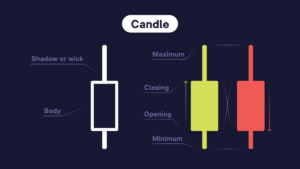
Each candle is a graphic representation of price movement over a specific period, whether it’s a minute, an hour, a day, or a more extended timeframe. It appears as a rectangle with upper and lower “shadows” (wicks) and upper and lower “ends” (body).
- Body: The part of the candle that represents the range between opening and closing prices.
The candle color is determined by the relationship between the opening and closing levels. Red usually indicates that the closing level was lower than the opening level, signifying a price decrease. Green typically signifies that the closing level was higher than the opening level, indicating a price increase.
- Wick or Shadow: Thin lines above and below the candle body indicating the highest and lowest prices within a certain period;
- Maximum: The peak of the upper wick, showing the highest price over a specific period;
- Minimum: The lower boundary of the lower wick, indicating the lowest price over a certain period.
Japanese candlesticks provide a more detailed insight into price movements, making them a crucial tool for technical analysis (TA).
Bar Charts
Bar charts, or histograms, make it easy to distinguish between them and candlestick charts, although both contain the same price information.
They display only opening and closing prices, as well as highs and lows within a specific time interval. Each bar on the chart represents a certain trading period, reflecting the price movement range. The top of the bar indicates the highest price, while the bottom indicates the lowest. The notch to the left of the bar shows the opening price, and to the right, the closing price.
Example: Bar Chart BTC/USDT on WhiteBIT
For more detailed information on price charts, you can explore the “Charts” section. Crypto exchange WhiteBIT also offers other types of cryptocurrency price chart displays: Hollow Candles, Area Chart, HLC Area, Baseline, Step Line, High-Low, and Heikin Ashi.
Each chart type provides a unique perspective on market data and can be used for various aspects of technical analysis depending on the trader’s needs and preferences.
Typically, price charts are accompanied by technical indicators and oscillators, providing additional information about the market’s condition, trends, and tendencies.
Trends and Trend Analysis
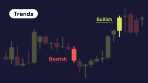
Trend refers to the long-term price movement in the market, which can be upward (bullish trend), downward (bearish trend), or horizontal (sideways trend). Traders usually prefer opening positions aligned with the trend to increase the likelihood of successful trades.
In an uptrend, long positions are logical, indicating buying assets with the expectation of further growth. Conversely, in a downtrend, short positions are taken, meaning selling assets with the intention to buy them back at a lower price. How do you identify a trend, and most importantly, how do you know when it has changed?
Trends are a fundamental component of technical analysis, and key ones include:
– Bullish/Uptrend: Characterized by a prolonged increase in the asset’s price;
– Bearish/Downtrend: Characterized by a prolonged decrease in the asset’s price.
There’s also the concept of “trends” which represent shorter-term price movement within an overall trend. Analyzing trends allows traders to determine whether the asset’s price will likely increase, decrease, or remain stable in the near future. Trends can vary in duration, from a few hours to several weeks, and are mainly defined as:
Uptrend
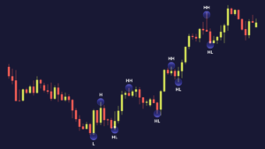
Uptrend: An uptrend is characterized by a consecutive increase in price. In this scenario, the trading instrument is in a growth phase, meaning its price is rising. The price moves upward, from point A to point B. In an uptrend, there is a consistent formation of a price sequence: HH + HL (Higher High + Higher Low), where the price updates its maximum without updating the minimum.
Higher High (HH): The maximum point that is higher.
Higher Low (HL): The minimum point that is higher.
Example: Uptrend
Downtrend
Downtrend: In contrast, a downtrend, or eastern trend, is a characteristic price movement in financial markets where an asset gradually loses its value. This trend is marked by the ongoing update of lows without refreshing highs (LH+LL).
LH (Lower High): The maximum point that is below the previous maximum.
LL (Lower Low): The minimum point that is below the previous minimum.
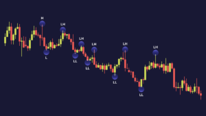
Example: Downtrend
Sideways Trend
Sideways: Prices fluctuate within a narrow range without significant changes in the long term. Traders in a sideways trend typically search for short-term opportunities.
Additionally, the concept of “Break of Market Structure” (BOS) or “Break in Market Structure” (BMS) is crucial in technical analysis. This point on the chart signals a potential change in price direction and can be vital for making trading decisions. It’s defined as a breaking point on the technical analysis chart where the trend of Lower Low (LL) — Lower High (LH) or Higher High (HH) — Higher Low (HL) is violated, and the price changes direction.
In the world of technical analysis, there’s a variety of approaches, and traders can choose methods and tools that align with their preferences and trading style.
Price Action Analysis: Some traders primarily focus on price movements and the formation of candlestick patterns and graphical figures. They believe that price action contains all the necessary information to make trading decisions. Price action analysis may include identifying support and resistance levels, evaluating trends, and different patterns.
Other traders prefer using various technical indicators and oscillators, such as the Relative Strength Index (RSI), Moving Averages (MA), Stochastic, and others. These instruments provide numerical data that can assist in assessing the “overbought” or “oversold” condition of an asset and determining the strength and direction of the market.