Patterns of Technical Analysis

Technical Analysis (TA) is a crucial tool that enables the assessment of the past and the determination of the future. It’s a system that interprets market fluctuations and mood changes, expressed in price movements that repeat over time in patterns. These patterns demand careful scrutiny but are the cornerstone of market forecasting.
Central to TA is the study of various graphical formations. These changes aren’t random; they result from sentiment — fear and greed — and even the balance between supply and demand. Describing all the figures of technical analysis in one article is challenging, so we’ll explore the most common ones, delving into the essence of each.
Triangle
A triangle is one of the fundamental formations in technical analysis. It is created by drawing lines connecting a series of highs and lows, forming a triangular shape that converges. It reflects a period of consolidation, market indecision, where the price range narrows between two trend lines.
Typically, an ascending triangle is considered a bullish pattern, while a descending triangle is bearish. In contrast, the symmetrical triangle is a neutral pattern. Let’s delve into each of them.
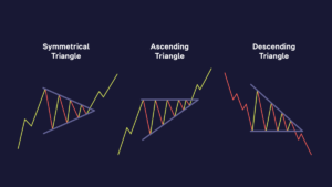
“Triangle” model
Symmetrical Triangle. This technical analysis pattern is formed when the asset’s price reaches lower highs and higher lows, converging to a single point. It usually indicates that neither buyers nor sellers can establish control, predicting a period of price consolidation. It’s considered a continuation pattern, meaning a breakout is expected in the direction of the prevailing trend before the pattern formed — bullish in an upward trend and bearish in a downward trend. However, as symmetrical triangles can break out in either direction, traders often view them as neutral and relatively risky.
Ascending Triangle. Characterized by a flat upper trendline and a rising lower trendline, indicating a continuation of the existing upward trend. The flat upper line acts as a resistance level that the price seeks to break, and the ascending lower line suggests higher lows as buyers gradually gain control. This pattern can signal a continuation of the uptrend or even a reversal during a downtrend.
The flat upper line serves as a resistance level that the price attempts to breach, while the ascending lower line indicates higher lows as buyers progressively gain control. This formation can develop over several weeks to months, with its reliability often increasing with the duration of its formation. An ascending triangle is typically considered a bullish pattern in an upward trend, suggesting that buyers are gaining strength and will likely push the price above the resistance level.
Descending Triangle. The opposite of the ascending triangle, it features a flat lower trendline and a descending upper trendline, pointing to bearish sentiments. The flat lower line acts as support, and the descending upper line shows lower highs as sellers push the price downward. A breakout occurs when crypto price breaches the support of the lower horizontal trendline, signaling a resumption of the downtrend. The lower trendline, once a support, turns into resistance.
Each of these models defines several key aspects. Firstly, the convergence of the two trend lines is a crucial moment for the triangle model. As price fluctuations diminish and the range narrows, the market “squeezes” like a spring, accumulating potential energy for a significant move.
Secondly, volume plays a vital role in confirming the pattern. Typically, volume decreases as the model develops and sharply increases upon breakout. A sudden volume surge confirms the breakout and may indicate the potential strength of the ensuing move. Therefore, traders anticipate increased volume when the trendline is breached and confirmed on higher time frames, helping confirm that the price is likely to continue in the breakout direction.

Rectangle
A rectangle, also known as a trading range or corridor, is a technical analysis figure that reflects a period of consolidation in the market.
Consolidation is a phase where the price of an asset trades within a relatively stable range, making no significant moves in either direction. This phase is characterized by a balance between supply and demand, indicating that neither buyers nor sellers control the situation, leading to sideways price movement. Such equilibrium suggests that traders are in a state of indecision, waiting for either the bulls or bears to take charge. But what can change this situation?
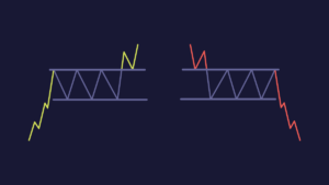
The price of the asset moves clearly between horizontal support and resistance levels, forming a “rectangle” on the chart. In the model, support is defined as a price level below the current market price where buying is strong enough to halt further price declines. Conversely, resistance is a level higher than the current market price, where selling is strong enough to stop further price increases. These levels are crucial as they determine the boundaries of the rectangle figure. Traders approach this model from two perspectives:
Range Trading. Some prefer to buy near the support level and sell near the resistance level, profiting from the price movement within the rectangle.
Breakout Trading. Others await a breakout from the rectangle. A breakout, ideally on volumes higher than usual, indicates the completion of the rectangle pattern and the start of a new trend. The breakout can be either upward or downward, depending on which boundary is breached.
Rectangles are easy to identify but may not be as easy to trade. Prices often don’t reach previous support or resistance levels, and sometimes they overshoot them.
Wedge
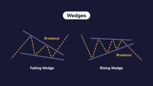
A wedge, or rising/falling wedge, is a price pattern formed by converging trendlines on a price chart. This pattern can signal both bullish and bearish price reversals. It has three common characteristics: converging trendlines, decreasing volume during the pattern formation, and a breakout of one of the trendlines.
There are two types of wedges — rising wedge (indicating a bearish reversal) and falling wedge (indicating a bullish reversal).
Rising Wedge: Forming during an uptrend, the rising wedge is considered a reversal pattern, suggesting that the trend is likely to change to a downtrend. This pattern is identified by two converging trendlines over time. The upper trendline connects the highs, and the lower trendline connects the lows. Notably, the accompanying decrease in volume during its development signals weakening upward momentum. The pattern is confirmed when the price breaks below the lower trendline. Typically, this breakout occurs on increased volume, providing additional confirmation.
Falling Wedge: In contrast, a falling wedge forms during a downtrend and often indicates a reversal, implying a potential upward price movement. This wedge is characterized by two converging trendlines that slope downward. The upper trendline connects the highs, while the lower trendline connects the lows. As the wedge develops, trading volume usually decreases, signaling a reduction in selling pressure. A breakout is anticipated when the price moves above the upper trendline. Similar to the rising wedge, a substantial increase in volume during the breakout strengthens the pattern confirmation.

Head and Shoulders Pattern
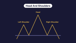
“Head and Shoulders” model
The Head and Shoulders pattern is a common technical analysis figure signaling a reversal of the prevailing trend. Particularly known for indicating a bearish reversal after an uptrend.
In this pattern, three successive peaks form on the chart. The central peak (Head) is the highest, while the two peaks on either side (Shoulders) are lower and roughly equal in height. The Head forms when buyers make a final push before yielding to sellers, resulting in the formation of the right shoulder, indicating that sellers have gained control.
The Neckline, a crucial component, is formed by connecting the lowest points of the two troughs between the three peaks. It can be either horizontal or sloping.
Ideally, volume should confirm the pattern. Typically, the volume is higher on the left shoulder and lower on the right. A significant volume increase is expected during the breakout, as the price drops below the Neckline. The Head and Shoulders pattern is primarily viewed as a bearish reversal signal, suggesting that the trend is likely to change after the formation of the right shoulder.
As with other chart patterns, traders should approach false breakouts with caution. Typically, confirmation of a breakout should occur on increased trading volume.
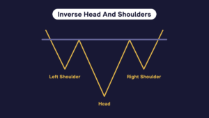
“Inverse Head and Shoulders” Model
The Inverse Head and Shoulders pattern is the bullish counterpart to the standard Head and Shoulders pattern, signaling a trend reversal from bearish to bullish. It forms with three troughs, where the central trough (Head) is the deepest.
It’s essential to note that the Head and Shoulders patterns depict a struggle between buyers and sellers. Furthermore, it’s a significant indicator of a trend reversal, but traders should exercise caution and wait for the complete formation and breakout before making trading decisions. Like all technical analysis tools, it’s most effective with other indicators and analysis methods within an overall trading strategy and risk management system.
Double Top
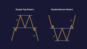
Double Top Pattern: This pattern emerges at the peak of an uptrend and is identified by two consecutive peaks of the same height, separated by a trough. It signifies a potential reversal from an uptrend to a downtrend. Confirmation occurs when the price drops below the support level formed by the trough, and traders often interpret it as a sell signal, anticipating a downward price movement.
Double Bottom Pattern: Appearing at the end of a downtrend, the Double Bottom pattern consists of two consecutive troughs of equal depth, with a peak between them.
It suggests a potential reversal from a downtrend to an uptrend. Confirmation happens when the price breaks above the resistance level formed by the peak. This breakout is commonly perceived as a buy signal, anticipating an upward price movement.
In both patterns, volume plays a crucial role. An increase in volume at the breakout point (downward for Double Top and upward for Double Bottom) provides additional confirmation. Traders often use these figures to identify entry and exit points, with the height of the formation serving as a reference for potential price movement.